In my Graphic Design for Professional Practices class, our first project was to create a logo. This included 4 different phases.
Phase 1 Create 48 different thumbnails, no color included. No design could be repeated.
Phase 2 From the 48 logos, you choose a logo, the class chooses a logo, and the professor chooses a logo. From those 3 logos, take the idea and reproduce 12 of each design.
Phase 3 One logo is chosen. With this logo, we were told to start incorporating color and refine the logo.
Phase4 The final logo is chosen with two very precise colors and prepared to be presented.
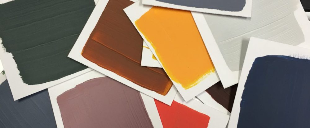
Color is powerful. Our professor, who once worked at a graphics company, told us a story to show us just how careful we must be when choosing color. He was creating a logo for a company, and during one of the beginning phases, he presented to the client a few logos. He designed one logo in particular that he thought the clients would love and would compliment their business identity well. But as he was presenting them to the clients, they quickly dismissed the logo due to the color. Despite his attempt to persuade them, they made up their mind simply because of the color, without any acknowledgement of the form. I thought this story was really important and particularly relevant to the project I was working on at the time. Form comes first. Our professor did not even allow us to include color until the final stage. This forced us to critique each other’s logos just on form. It wasn’t until the form was finalized were we allowed to start incorporating color.
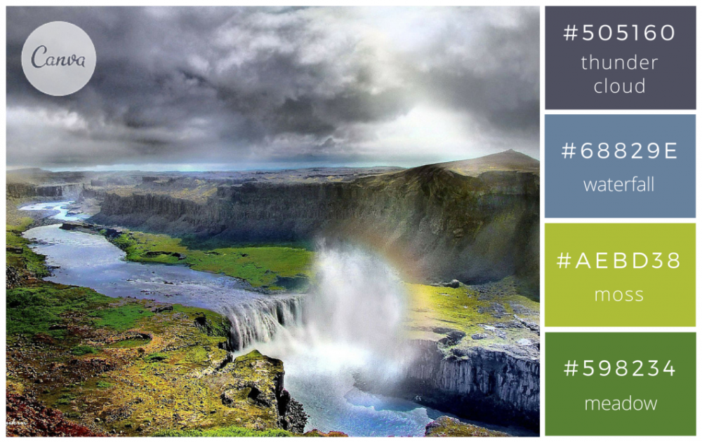
I stumbled upon the website: https://designschool.canva.com/blog/100-color-combinations/. It addresses many important aspects of color and the impact has on a design. Color has the power to set the mood. For example, the color blue seeks tranquility and peace. This is important to keep in mind when exploring color variations in relation to the purpose of design. I found this website to be particularly helpful because the colors chosen were very authentic. The layout of the website was a picture with four corresponding colors taken from the picture. Then under the color was a brief commentary on the chosen samples. For example,

In my logo design, I utilized the color “moss” because of it’s compatibility with other colors, yet popped when surrounded by color. I found this website very helpful because it gave context to the color, rather than two colors places on a white sheet next to each other. It shows the way the colors interact with each other.
Give credit color deserves in your designs!
Sources:
Kliever, Janie. “100 Brilliant Color Combinations and How to Apply Them to Your Designs.” Design School. N.p., 26 Apr. 2016. Web. 19 Feb. 2017. <https://designschool.canva.com/blog/100-color-combinations/>.
